#EN1.5 Big fish
Holistic and analytical visions in photographic composition.
In this article, we’ll talk about composition and fish. The organization of elements within the photographic frame is one of the topics I find most interesting and to which I return repeatedly. There are many different ways to read an image but to start, we can decide whether to analyze its details or look at it as a whole.
I have no formal education in photography, but I’ve undertaken several courses, seminars, and workshops. The most significant benefit was learning to work with images through different approaches. However, there is one thing I’ve noticed that unites almost all of these paths when it comes to talking about composition. On the one hand, there are granitic rules, often presented as universal: the rule of thirds, the golden section, balance and weights, principles of good form, and so on. But on the other hand, despite these exact notions, I always felt like I was missing something. All these principles are not wrong or unreliable, but maybe they work only up to a certain point.
«A narrator constructs a world - and being thoughtful about it will do you wonders [...]. Narrativity is world-building, or at least scene-setting, and if you’re not cognizant of the potential results of what kind of house you’ve built and the order of each room, you can make a dog’s breakfast out of it all quickly». Ian Lynam, The Impossibility of Silence: Writing for Designers, Artists & Photographers. Onomatopee, 2020 edition.
Composition is a treacherous subject: when you think you’ve learned enough, you discover that there is still much more underneath. I also fell into this trap while typing this article: I thought of it as one of the quickest to write, and instead, I bumped my nose against so many doubts that I spent four days among books and photographs to clear my head and find my way back to making sense. I managed to lose myself in the house I was building.
A few years ago, I attended a seminar about composition in art. The lecturer demonstrated various notions by drawing simple dots and lines on the blackboard. I particularly remember her explanation of balance and “forward” movement, from left to right, perceived as natural because this is the common reading sense in our culture. I always found this statement simplistic and a bit hasty.
Writing and reading are skills that go back to ancient human times. However, they’re more recent than calculus and use images to describe and communicate.
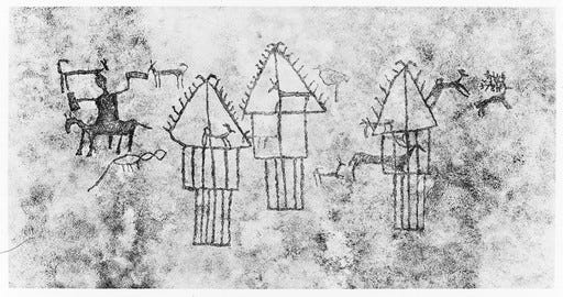
Mass education in reading and writing is a modern invention. My grandfather received a fourth-grade “diploma” only so that he could be sent to war1 while his father, my great-grandfather, I doubt knew how to read and write, at least not as fluently as I do. We are talking about Europe between the 19th and 20th centuries, which is not long ago.
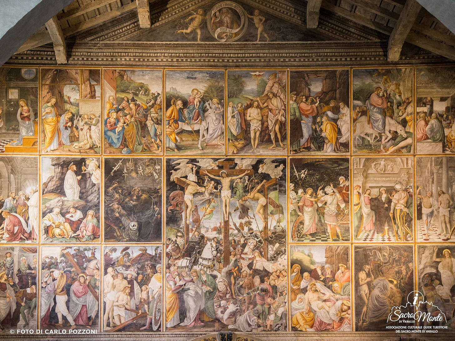
Many of us are used to seeing frescoes from the 1500s in books or museums as works of art. But very often in churches, especially those outside urban areas, these paintings were educational tools aimed at the illiterate population. So, they could not be used to read the scenes from left to right because that was their sense of reading and writing.
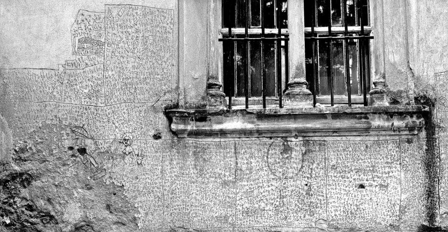
The earliest forms of writing were boustrophedon2, the direction changed from line to line, left to right and then right to left, and so on, like oxen plowing.
Over the centuries, hundreds of factors have caused one writing style to be adopted in one culture rather than another. One thing is sure: writing also reflects the cognitive structure of individuals belonging to a certain culture at a certain time.
«Everyone has the same basic cognitive processes. Maori herders, !Kung hunter-gatherers, and dotcom entrepreneurs all rely on the same tools for perception, memory, causal analysis, categorization, and inference [...]. Human cognition is not everywhere the same». Richard E. Nisbett, The Geography of Thought: How Asians and Westerners Think Differently - and Why. Nicholas Brealey Publishing (edizione Kindle), 2011.
Early psychology scholars, like the Gestaltists, believed in universal thought structures that applied to everyone. However, during the first two decades of the 20th century, there was no cross-cultural research, and psychology mainly focused on studying the European, schooled white man (unfortunately, this approach also supported supremacist theories and discrimination).
Modern psychologists today acknowledge that specific basic cognitive processes, like memory and perception, are the same for everyone. However, they also recognize that people from different cultures perceive and interpret reality differently.
«The Chinese believe in constant change, but with things always moving back to some prior state. They pay attention to a wide range of events; they search for relationships between things; and they think you can’t understand the part without understanding the whole. Westerners live in a simpler, more deterministic world; they focus on salient objects or people instead of the larger picture; and they think they can control events because they know the rules that govern the behavior of objects». Richard E. Nisbett, The Geography of Thought: How Asians and Westerners Think Differently - and Why. Nicholas Brealey Publishing (edizione Kindle), 2011.
Richard Nisbett is an American social psychologist. I stumbled upon some studies conducted with colleague Yuri Miyamoto some time ago. One of the experiments involved presenting a brief video of an underwater scene to American and Japanese students.
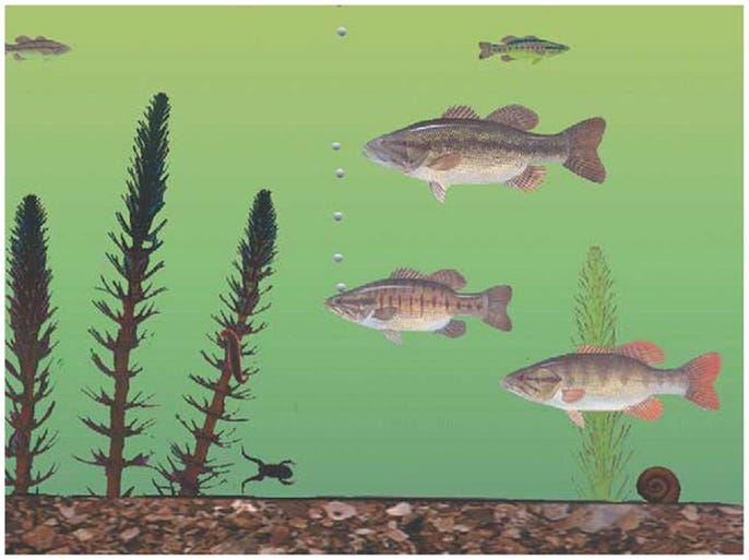
After watching the scene, students were asked to report what they remembered most. The American students recalled more information about the big fish or group of fish and their movements, while the Japanese students recalled more details about the background elements and relative positions among the smaller animals, seaweed, and larger fish. This trend was observed in several other experiments, where American-European students tended to focus on specific elements of the scene. In contrast, Japanese and Chinese students paid more attention to the scene as a whole, as well as the relationships between parts and the foreground and background.
«Not only are worldviews different in a conceptual way, but also the world is literally viewed in different ways. Asians see the big picture and they see objects in relation to their environments—so much so that it can be difficult for them to visually separate objects from their environments. Westerners focus on objects while slighting the field and they literally see fewer objects and relationships in the environment than do Asians. If some people view the world through a wide-angle lens and see objects in contexts, whereas others focus primarily on the object and its properties, then it seems likely that the two sorts of people will explain events quite differently. People having a wide-angle view might be inclined to see events as being caused by complex, interrelated contextual factors whereas people having a relatively narrow focus might be prone to explain events primarily in terms of properties of objects». Richard E. Nisbett, The Geography of Thought: How Asians and Westerners Think Differently - and Why. Nicholas Brealey Publishing (edizione Kindle), 2011.
I began to look at photography from this perspective. Suddenly, many of the European and American works seemed more like anthologies focused around a central subject, deprived of individuality, transformed into the representative of a specific category.
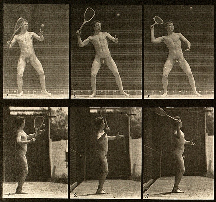
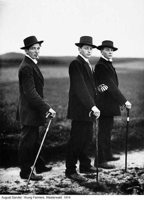
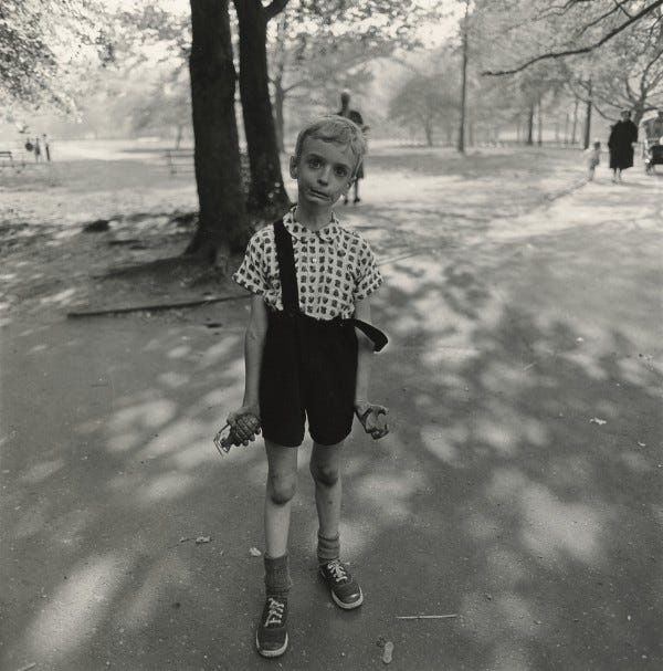
Or a collection of locations separated from both time and space.
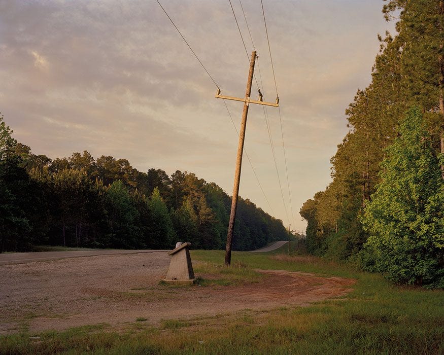
In contrast, the works of authors from the Far East seemed less analytical and more based on the relationships between elements and people, where it is more difficult to separate a main subject from the background and other components of the image without heavily changing its meaning.
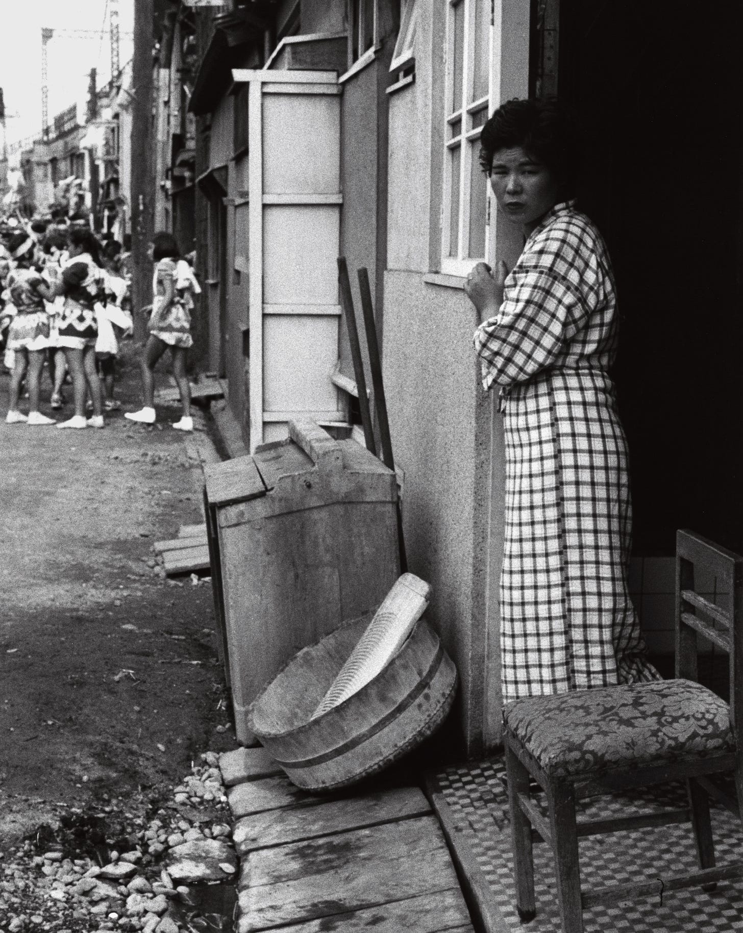
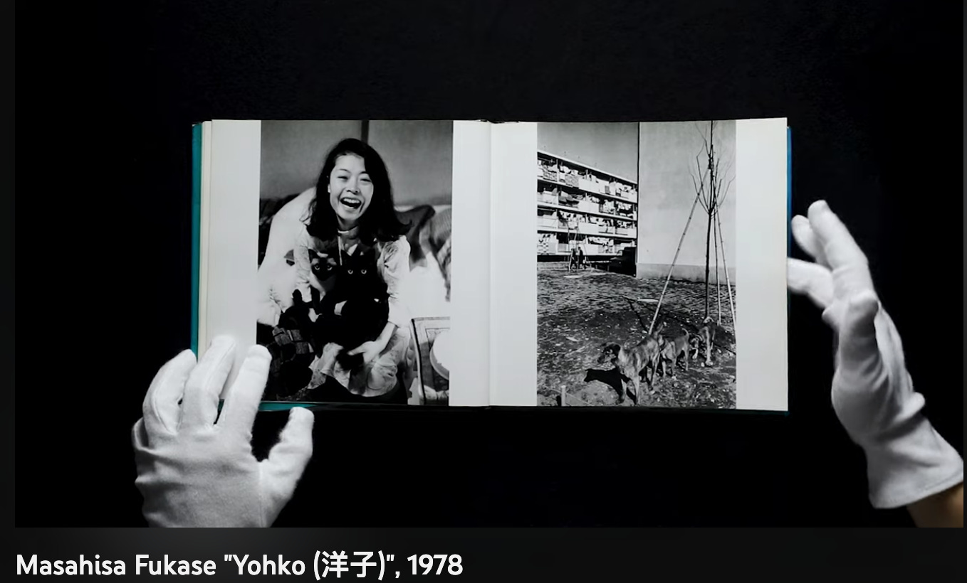

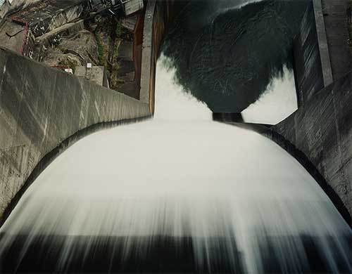
Now, researching when you are firmly convinced of something rarely is a good idea: you’ll mainly find evidence that verifies your starting hypothesis. The smartest way to prove that elephants trumpet is not to check all elephants (and the like) but to find an elephant that barks.
Let’s use an example: the work of Rineke Dijkstra is a series of photographs where all attention is focused on a single subject, and nothing else matters. The background is generic, and the person is central. But there is so much humanity in the girl that I cannot see her as the representative of a category but as an individual.
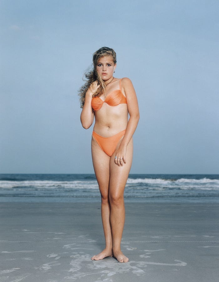
«At first sight, her full-frontal beach portraits of European and North American teenagers look simple and straightforward, much like the work of August Sander, whose subjects seemed to define themselves by their sheer physical presence, with little intervention on his part […]. The photographer does not assert her presence aggressively, as Arbus does. The subjects seem to produce their own glow […].
The tug-of-war for control between photographer and subject is always present in a portrait session. Some photographers, such as Diane Arbus and Richard Avedon (see Chapter 1), habitually choose moments when their subjects appear to be dominated by the power of the artist’s gaze. Others, such as Walker Evans and August Sander, choose moments when their subjects seem to transparently assert themselves, as if the photographer was not present. In either case, albeit differently, the pose seems resolved. The subject is either dominant or dominated. Dijkstra has it both ways. She preserves the tug-of-war by seeking out the indecisive or transitional moment, when a pose is either starting to form or is in the process of disintegrating[…]. At the core of each pose is a feeling of instability and tension. This can be seen as a perfect emblem of adolescent uncertainty, but it is also a signature element in all Dijkstra’s work […]». Roswell Angier. Train Your Gaze: A Practical and Theoretical Introduction to Portrait Photography. Ava Pub SA, 2007.
Nisbett’s research examines the variations in thinking that arose from the geographic, economic, and social discrepancies in which European (specifically Ancient Greece) and Eastern (China) cultures evolved.
This view sets precise boundaries for the issue, not considering individual dispositions and neurological characteristics but also specific historical (the Zeitgeist) and situational contexts. Not that it is wrong, but as is often the case, what can be stuffed inside the boundaries of a scientific experiment is just a tiny part of a more complex reality.
It is some work’s tendency (not certainty) to adopt an analytical rather than a holistic approach. I won’t maintain the geographical division of East and West because I find it reductive and limiting. Furthermore, I believe the world has grown in size and interconnectivity over the past fifteen years, making it challenging to categorize it into distinct subgroups.
Consider, for example, two very similar-looking series: Richard Avedon’s In the American West and Gyahtei by Manabu Yamanaka 山中学. In both series, the subjects are in the center of the frame, shot against a uniform white background and looking into the lens.
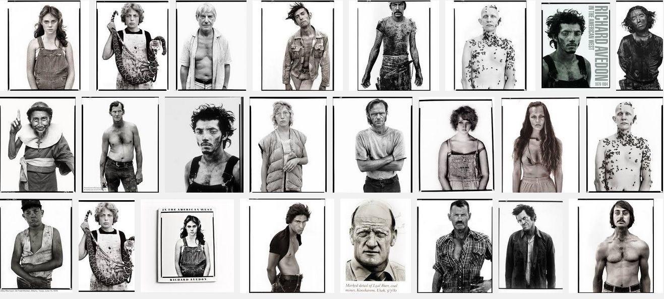
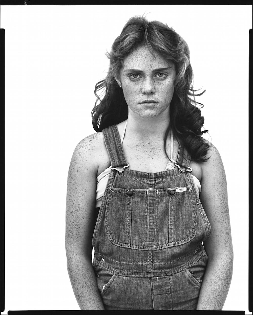
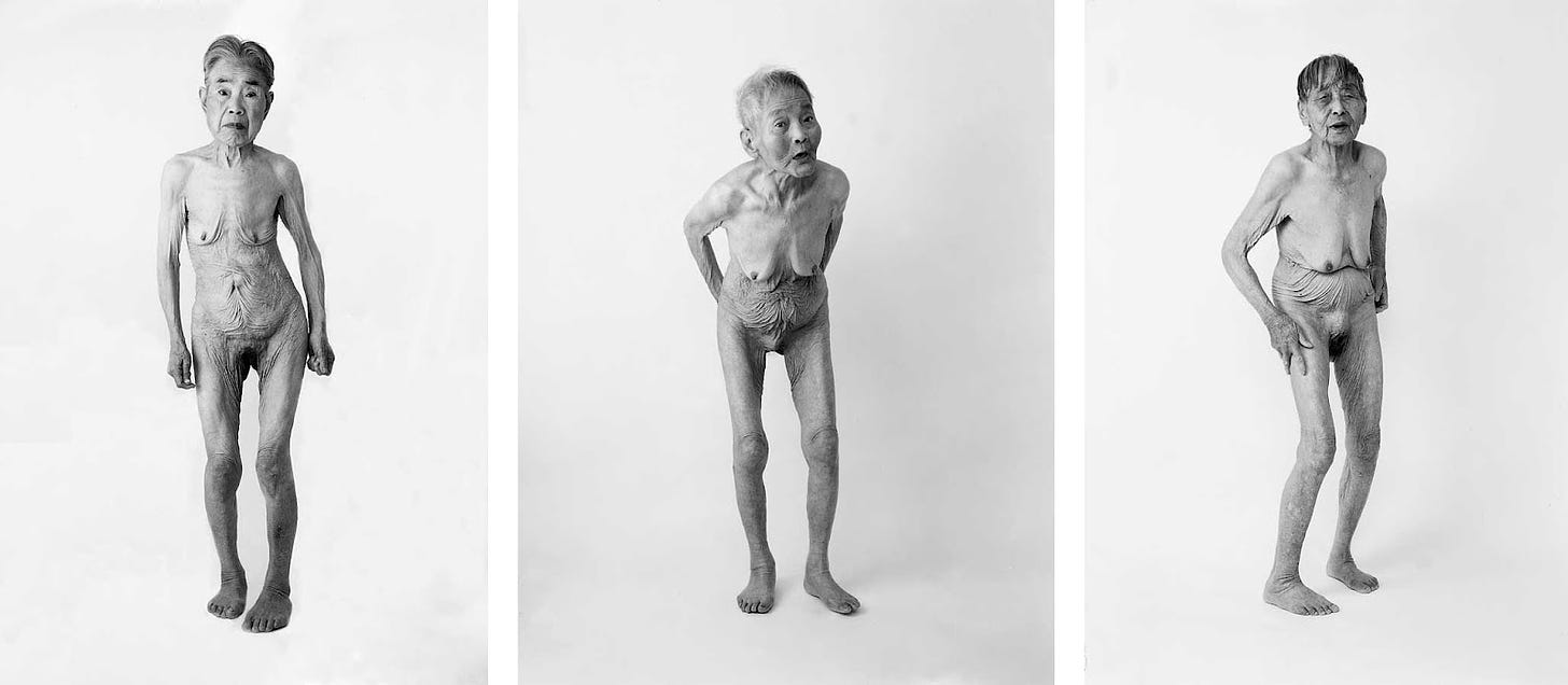
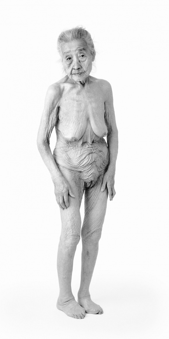
At first glance, Avedon’s series is more varied. The subjects against the white background show many differentiating details and poses. Yet, next to Yamanaka’s work, the people portrayed by Avedon seem frozen within a role; they are simultaneously the characters of a real and imaginary space within the photographer’s mind. Somewhat like in August Sander’s work, there is an appeal to the solidity of categories, in this case, the representation of the American West.
After Gyahtei’s first exhibition in the United States, Michaël J. Amy wrote in Art America, May 2000:
«“We fail to make proper distinctions when we face something we are unfamiliar with. I, for one, had to be persuaded that several of these women were not one and the same person. Age obliterates, and Yamanaka does well to confront us with it in this grim, startling and unsentimental way.”
Because of the startling nature of the subject matter, the writer’s eyes clouded over […]. His initial perception, that the 17 women in the series were really the same woman, stereotypes old women—particularly naked old women—as being the same. They cease to exist as distinct individuals, and collapse into the distancing and comforting misperception of a category». Roswell Angier. Train Your Gaze: A Practical and Theoretical Introduction to Portrait Photography. Ava Pub SA, 2007.
The first impression in front of Yamanaka’s portraits is polluted by a form of group-serving bias, that is, a distortion in the perception of the members of our social group compared to those of other groups. Others always seem more equal to each other than to us. The return to categories is comforting, trying to pigeonhole what we see and do not immediately understand into a stereotype, a pattern, recognizable and predictable.
Unlike the portraits of the American West, which seem like eternal characters in a story, Gyahtei’s women are individuals in the frame, fragile and vulnerable, in a precise instant of time.
These two compositions share similar aesthetics, white background with a centered subject, but evoke vastly different emotions and convey diverse information. What other factors contribute to this contrast?
The difference is not in a single element but in the whole. The proper quality of a composition is a quality-Gestalt. It is independent of the qualities of the individual parts; it is not given by the elements, but by the relationships between them, by their structure. It is evident in music: a melody remains the same even when the notes are changed (for example, by transporting it from one instrument to another).
When it comes to composition, especially in introductory courses and books, there is a tendency to list individual style elements and their effects. What is left somewhat for granted is that the strength of the impact varies according to the relationships with everything within the frame.
The focus is almost exclusively on the subject’s characteristics or the main elements. Which makes sense, especially from an educational point of view. It can generally be easier to understand how something works by analyzing its elemental components individually. It’s important not to limit ourselves to this reductionist analysis. We should also consider the whole, the big picture.
We can give an example with the rule of thirds, one of the sacred rules for those who approach photography. It helps to guide the eye, but not every image that follows the rule of thirds is a good picture. For me, it is not a matter of breaking the rules; on the contrary, it is a matter of knowing them as well as possible so that we can use them to the best advantage for our purposes. It is the combination of knowledge and pragmatics.
«“Background” is an odd word. […] the word also suggests a lack of value, relative to its complement or opposite. Photographers and viewers alike tend to pay less attention to what is in the background of a picture because they think it is less important than what is in the foreground. This is a mistake. You should always think of background and foreground as two equal parties to a visual conversation. A background should have something to say, even if it is blank […]. Richard Avedon’s white backdrop paper is functional because it transports his subjects into the isolating intensity of the photographer’s way of looking. Manabu Yamanaka’s luminously white backdrops, although similar to Avedon’s, function differently, daring us to contemplate his naked subjects with the empty mind of Zen meditation. In the sense that they contextualize and actively direct our responses to what we see, all backgrounds function as stage sets. It doesn’t matter whether the settings are carefully fabricated or found by chance. They should all be treated as constructions, because they are bearers of meaning. They are never neutral». Roswell Angier. Train Your Gaze: A Practical and Theoretical Introduction to Portrait Photography. Ava Pub SA, 2007.
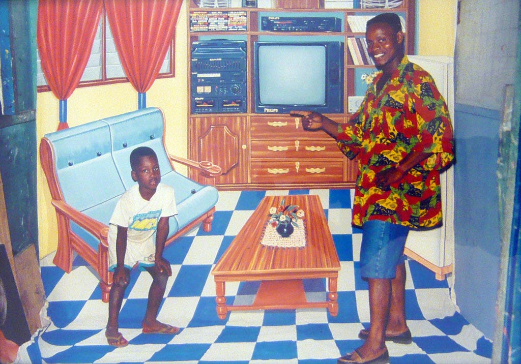
I know very little about how other cultures explain and value artistic composition. I’d love to learn more about this topic. How we see the world, by innate dispositions or because we are taught, is reflected in how we reproduce it.
Composition is not only about the spatial arrangement within the frame but also about the relationships between all the other dimensions, colors, lights and shadows, for example. In films, the composition can also be conveyed by movement.
There’s tremendous attention to the relationship between what is happening in the foreground and background in Akira Kurosawa 黒澤 明明 movies. Backgrounds are always alive, animated by movement or atmospheric elements. They are not fixed scenes whose only purpose is to define the context of a story, where and when it’s set. But they are part of it and give the idea that there is a vast lively world beyond what we see on screen.
Speaking of cinema and composition, I can only end this article with Yasujirō Ozu 小津 安二郎, through the words of Riccardo Falcinelli (which I try to translate as best I can):
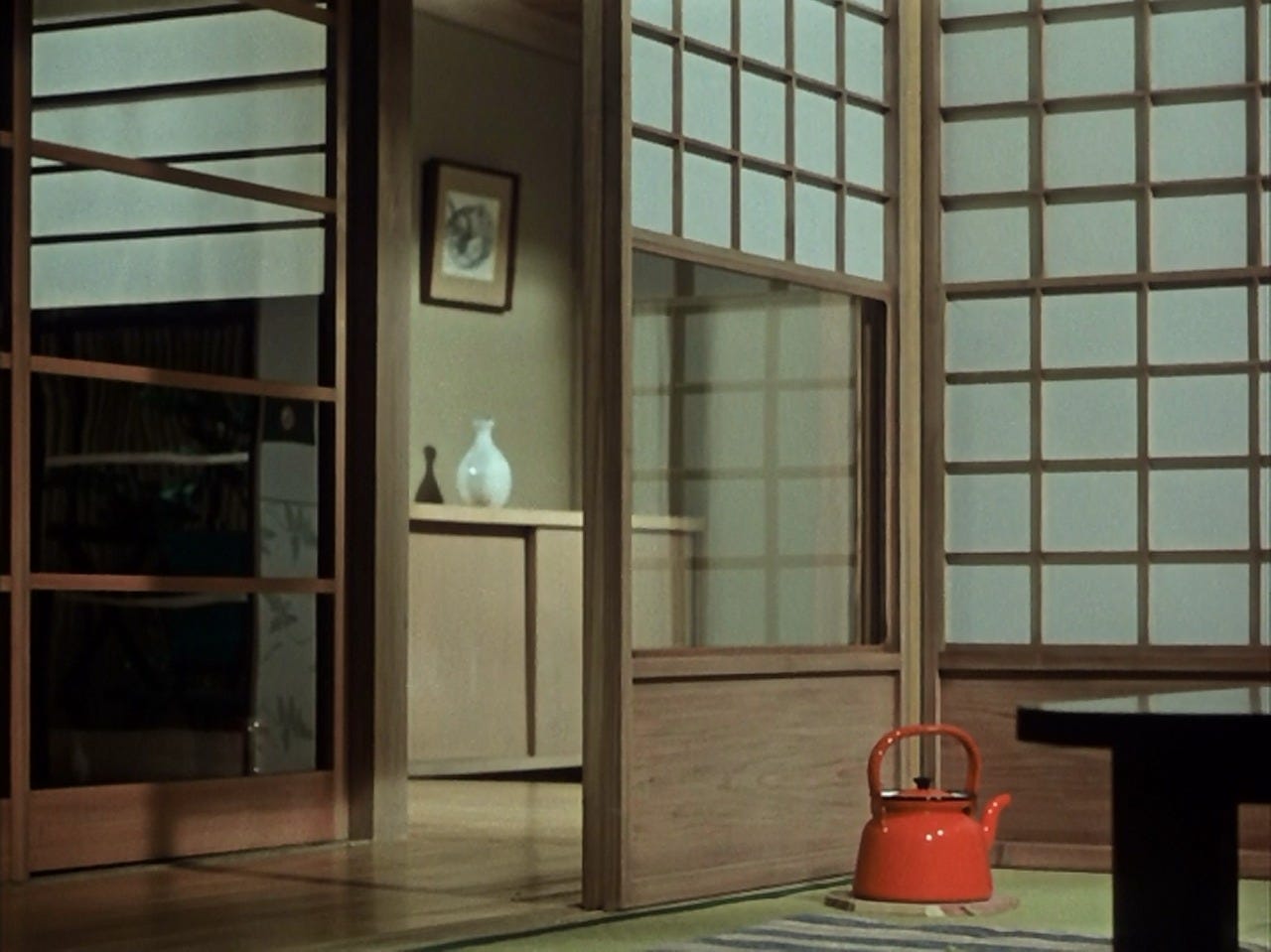
«Japanese director Yasujirō Ozu used to arrange every object in his films himself: pillows, curtains, teapots, sake bottles. Then he would take many photographs to study the viewpoints and general composition [...].
Now, one of the laws of classical cinema - the one codified primarily in Hollywood - dictates that the continuity between images must never be broken: that is, between scenes, objects, light, and actors must always be in the same place [...]. Ozu knows these rules well - he begun working in the 1920s when Japanese cinema was modeled on American films - but he decides to do his own thing: for him, what matters is the balance of the individual frame, as if it were a painting.
[...]
Following this logic, Ozu would even go so far as to change the dimensions of things [...]. When critics pointed out to him that these were mistakes, he calmly replied that he was interested in something else, that in cinema - as indeed in all art - there is no one way to do things [...]. Such behaviors can be interpreted as character traits, and they certainly are. However, it cannot be ignored that in Japanese culture, the way of arranging things is an art unto itself, with a centuries-long history: think of the spaces in the traditional home covered with tatami mats stuck together, or Zen gardens or ikebana, the practice of arranging flowers in vases.
[...]
Composition in painting is thus the emended life not of the ugly or the painful but of the out-of-tune aspects». Riccardo Falcinelli, Figure. Come funzionano le immagini dal Rinascimento a Instagram. Giulio Einaudi Editore, Torino, 2020.
«Moreover, by photographing, by “resisting” in the abyss of the mirror through his act as photographer, it is thus to photography that Degas entrusts - reaffirming himself in this as a disciple of Nadar - at least part of the task he suggests, to ensure that the “here” continues to be the place endowed with value». Yves Bonnefoy, Poesia e Fotografia (Poetry and Photography). O Barra O Edizioni, 2015.
World War II.
