#EN1.9 Far, near

When distance is not just a matter of focal length.
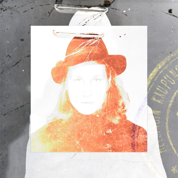
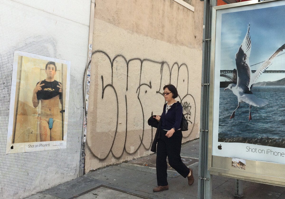
In the Summer of 2015, I spent two weeks wandering around California. One of the things I remember is the Shot in iPhone 6 advertising campaign, a worldwide gallery of images taken only with the iPhone 6’s new camera. The photographs were everywhere, online and offline, printed on giant posters, as well as in newspapers and magazines. Perhaps this was the first year smartphones began to be taken as “real” image-making machines.
We already knew for years that smartphones could take pictures. But after this campaign, Apple declared that its product could make images equivalent to professional ones, both in apparent qualities and uses. The new iPhone was a tool for making art, unleashing anyone’s creative potential1. If I remember well, 2015 was the year mirrorless cameras appeared in the photographic market, too2. This innovation began to shake up the idea of what equipment a person needed to create high-quality visual content, providing, in return, an easier and faster workflow from creation to publication (or at least that was the idea).
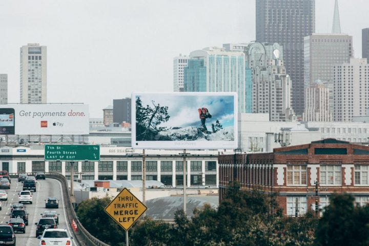
The campaign was a huge success, winning the Outdoor Lions Grand Prix in 2015, and was picked up again the following year. The brilliance came not so much from the product itself, innovative as it was, but from the way it was presented, showing not “the what”, but what it could do:
- create images of such quality that could be printed in giant format
and
- give the impression that anyone with a “simple” phone could create something worthy of worldwide visibility.
The photographs selected by Apple for the World Gallery came from both professional photographers and amateurs, but in the campaign, everyone was put on the same level. The signature was something like “by Mario R.”, no surname, to give the impression of the average person.
Apple has always pushed marketing to the max, more than any other company, sometimes creating real distorted, ideal, hyper-realistic worlds that reflect the buyer’s desires (or instill them?), that Apple itself is always ready to fulfill.
«The World Gallery, in its sublime timeless imagery, puts the viewer at a distance, like much advertising does. As sociologist Michael Schudson writes in Advertising, The Uneasy Persuasion, “advertising looks more real than it should.” Schudson cites sociologist Barbara Rosenblum that in most advertising photography “light is used in conjunction with focus to create a hypertactile effect.” That hypertactile effect is also at play in the World Gallery, whose distancing aesthetic puts the viewer somewhat at a remove from the scenes represented. These scenes appear too real to be taken from everyday life. At the same time, and unlike what is found in most advertising photography, the World Gallery does not display images of the product sold. It is made by means of the product. The World Gallery displays images shot by users, who thanks to Apple, now have a global stage for their photography. By inviting people to identify with these ordinary artists, “we” visitors of the World Gallery are given access to that wonder, too, not just by admiring the photographs—at once art and ads—but also by creating our own images, after having purchased an iPhone of course». Niels Niessen, Shot on iPhone: Apple’s World Picture, 2021.
Considering visual language, this Apple ad campaign uses the physical distance between the viewer and images to its advantage. Images are printed so large that the only way to look at them is from a great distance. There was virtually no other way to see them: they were almost always printed on titanic billboards on the side of highways or hung on the facades of skyscrapers. The smallest billboards I saw must have been the ones on the sides of bus shelters. Which are usually so dirty that they hardly invite people to approach. And backlit, just like a smartphone screen, and that too is no accident.
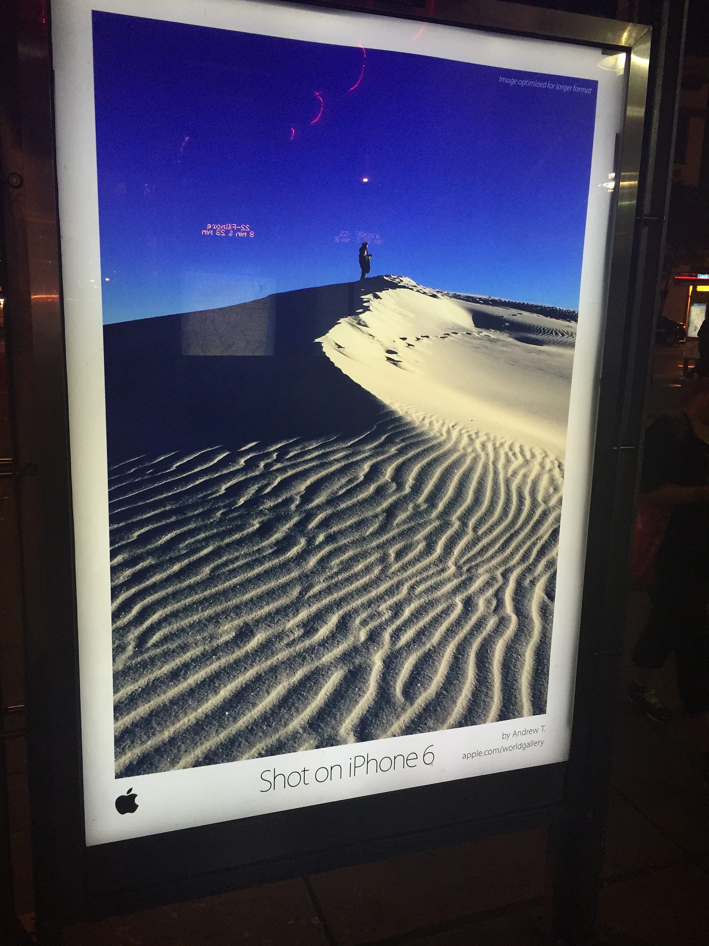
Usually, any photograph printed larger than an A3 size (297x420 mm or 23.39x33.11 inch) leads one to take a few steps back to look at it as a whole. A photograph looked at from a distance (or very small, as on a phone screen) always looks sharper, more in focus, and more beautiful than when looked at up close. Part of Apple’s marketing was to make people believe that the camera aboard their new device allowed them to create professional-quality images. But no matter how much they processed and printed to get the most out of it, the file was still far from the quality of a JPEG developed from a digital negative.
The camera aboard the new iPhone was certainly better than previous versions, although it couldn’t hold a technical candle to an SLR or a film camera, especially in difficult lighting conditions. Yet it still manages to give us the perception of a professional result, providing sufficient quality for the distance (or position) from which we are looking.
«So what do the images on display in the World Gallery have in common, other than all having been shot on an iPhone 6? First of all, the World Gallery demonstrates that the iPhone’s camera is so powerful that its high-definition pictures can be blown up to billboard-size format (be it with the aid of some image processing). Second, the campaign proves that thanks to the iPhone 6 everyone is a potential artist. As visual studies scholar Marita Sturken writes, Apple’s photo advertising is “indicative of the increased blurring of the roles of amateur and professional that has emerged in the digital economy”». Niels Niessen, Shot on iPhone: Apple’s World Picture, 2021.
“Professional quality” is a fuzzy concept, sometimes meaning everything and meaning nothing. While images have objective quality parameters for which they can be evaluated as “right” or “wrong”, the perception of quality does not have such precise indicators; it is a more elastic concept that can be shaped as needed.
In this era, we make use of images from a distance most of the time. Although photography has entered our homes, always at our fingertips to be consumed as needed, images still remain distant. The photographs we see on the Internet, on social media, and on our phones and computers, are small. Which is kind of the equivalent of saying they are distant, we look at them from afar and in a hurry, kind of like roadside billboards.
«Ever since the power people decided that photography is an Art, just as in creating God in man’s image rather than the other way around, a lot of people are trying to make photographs that look like Art rather than enlarging the concept of what art is or what it should look like. Prints are getting bigger while ideas are getting smaller. If one looks carefully at most of the very large prints in galleries and museums, it is clear that most of the pictures are not very interesting if you take away the size factor. Remember the ant? By trying to make photographs more than what they inherently are, we LOSE what they inherently are, and the magic disappears. Since photographs are not very complex physically, the difference between an ordinary picture of something and a photograph that has a transcendent or other emotive quality can be extremely subtle and fragile. I’m not suggesting that making large prints is wrong, it’s just not necessarily a gain and can be a loss». Philip Perkis, Teaching Photography: Notes Assembled. Kindle Edition.
A slightly blurred photo, and I’m not talking about creative intent, can look great when viewed as a square on Instagram. This way, photographs lose any sensory and textural qualities, the few they had compared to a painting or sculpture, and are increasingly at the mercy of the viewer’s interpretation. The mind compensates for details it does not receive from external stimuli by always putting in something of its own.
Keeping the observer at a distance is not just a way to fool the observer. Distance and size are factors that must be taken into account in the creative process, and it can be a way to make the invisible visible or inevitable something you do not want to look at.
Larger images are more likely to be seen; huge ad spaces are more expensive than smaller ones everywhere. Visually, size is an empirical clue that tells us what to look at. Within a photograph, larger elements have more visual weight, and when we create or look at an image we can ask ourselves, "What am I giving more weight to?"
But we must also remember that weak content (a message) does not become stronger if we magnify it, it only gains fragile importance and the trick can be easily exposed by creating a “the Emperor is naked” effect.
In photography, we can also consider other types of distance beside the spatial distance between the image and the observer. Interpretation is always the result of an interaction of the photographer-subject-audience triad. Sometimes the vertices may collide, in pairs or all three together, and the image lies in between.
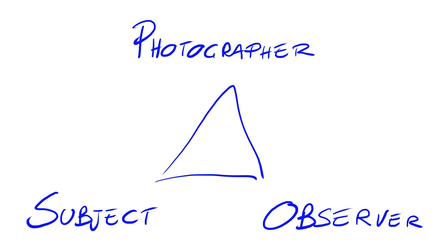
Perhaps I am simplifying things a bit, however, I find it an effective model to explain what I mean. Try to follow me.
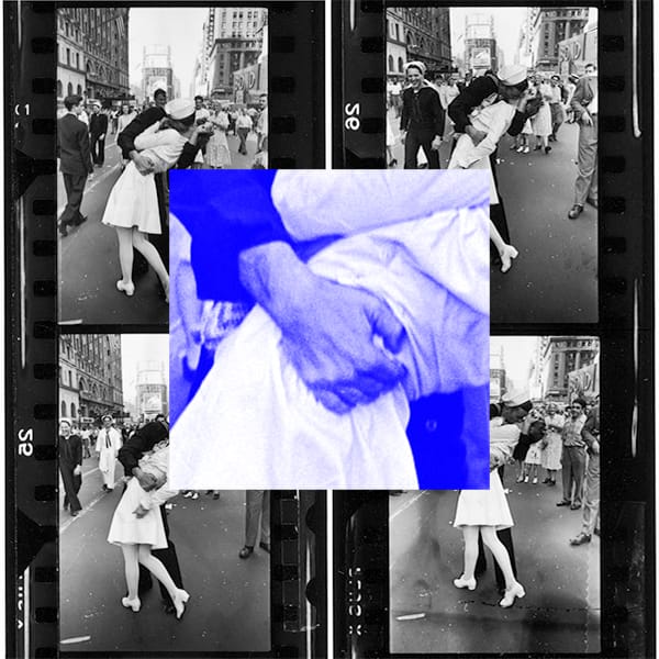
Let’s say the photographer and the observer are close to each other and equidistant from the subject: they have the same point of view on the subject, and the photograph created will be interpreted very similarly by both of them. We can say that their point of view is, more or less, the same. This is one of the reasons why I explain the tenacity of some to defend the Afghan girl as one of the highest peaks of contemporary photography, despite all the issues she carries with her. These are often white men of the same generation (and probably with the same cultural and social references) as Steve McCurry.

On the other hand, if the subject and the photographer are very close to each other but distant from the viewer, as in the case of research or personal works, what the photograph communicates may be interpreted differently by the observer, if not rejected. It may even elicit a disturbing effect, sometimes.
And what if the subject and the observer are close while the photographer is distant? Again, it may be that the viewer does not like the result of such a detached gaze. Here’s a short story. I didn’t note the references when I heard it but I assure you it’s true and the source is reliable. Someday the author’s name will come back to me. Perhaps.
A few years ago a photographer lived for a few months in a small community in Wales, documenting its life and people as part of an art residency program. At the end of the project, he printed a book that he had hand-delivered by rugby players from the local school to all the residents. Everyone got so mad after looking at their portraits, and their lives through that photographer’s eyes, that they organized bonfires among neighbors to destroy all copies of the book. Someone finally tried to sell the remaining copies on eBay making some money.
«Normally, if there is any distance from the subject, what a photograph “says” can be read in several ways. Eventually, one reads into the photograph what it should be saying. Splice into a long take of a perfectly deadpan face the shots of such disparate material as a bowl of streaming soup, a woman in a coffin, a child playin with a toy bear, and the viewers - as the first theorist of film, Lev Kuleshov3, famously demonstrated in his workshop in Moscow in the 1920s - will marvel at the subtlety and range of the actor’s expressions». Susan Sontag Regarding the Pain of Others, Penguin, 2004.
Whenever there is some distance our mind fills in ambiguities by inferring traits, thoughts, and feelings. According to the Gestalt School, it is the principle of closure that allows us to complete information and see what is really not there.

Let’s take it a step further. In talking about distance, I mean the spatial dimension but also refer to time and emotion. Photographs are time machines that make it possible to extract moments and see them again in the future, outside the original time stream.
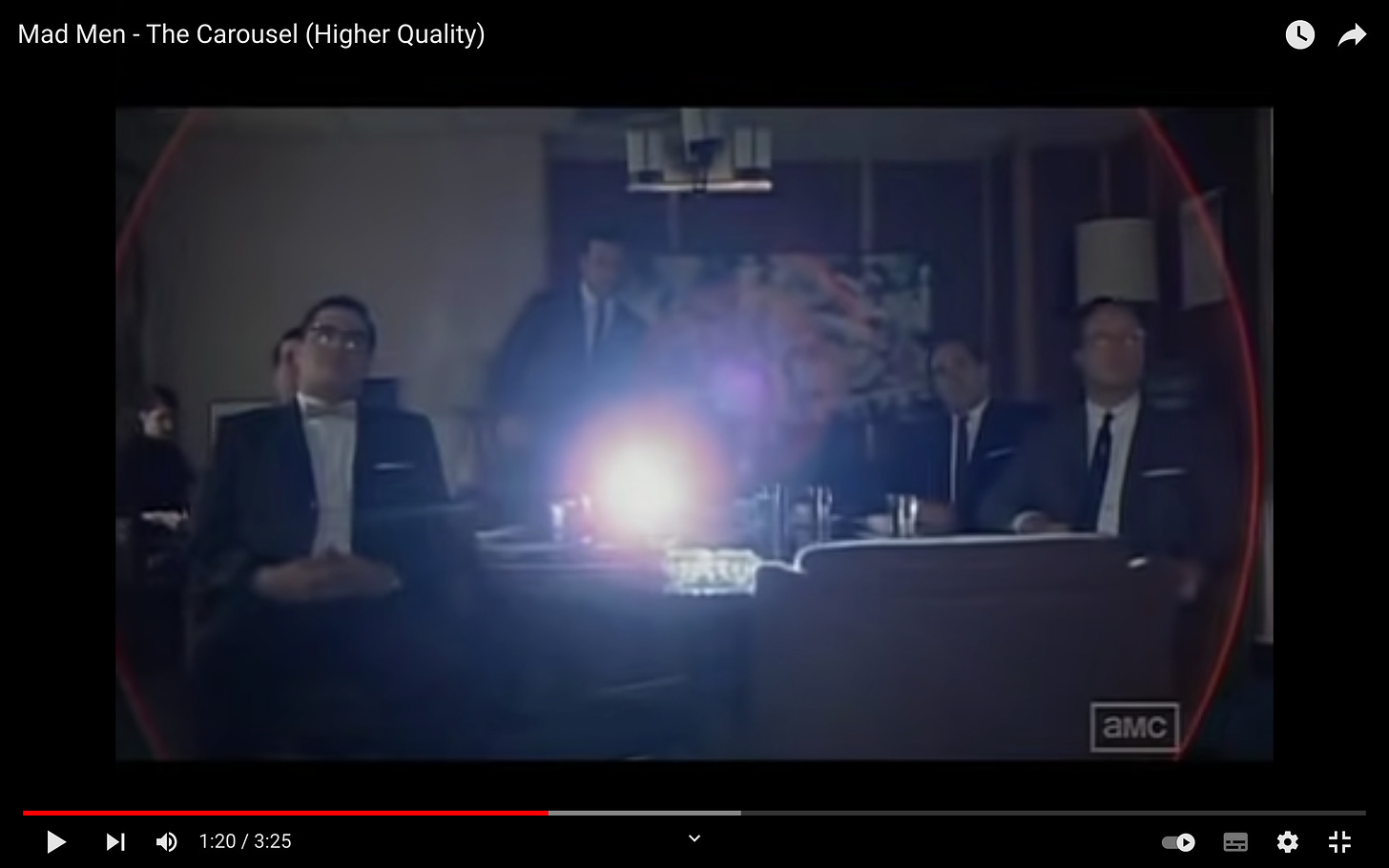
«This device isn’t a spaceship, it’s a time machine. It goes backwards, and forwards…it takes us to places where we ache to go again». Mad Men, The Carousel.
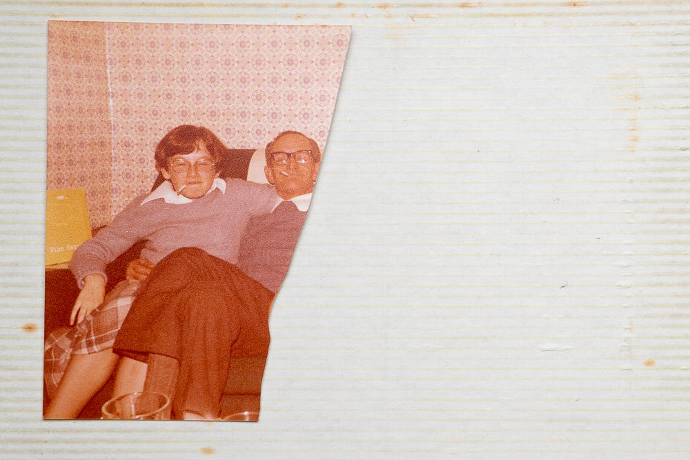
Time is a basic characteristic of photographs. Photographers or observers, what we see depicted is always at least a few seconds beyond the actual event. Time can make common images such as family photos interesting. It can be the fascination of something old or the testimony of something that no longer exists.
Time makes even discarded moments part of a story, like pieces of a mosaic understandable only from a distance. Time helps to forget constraints, and boundaries become more fluid. Looking at old photographs is engaging because we can put something of our imagination and fantasy into them, they activate our brains instead of just reconfirming something we already know and have at hand every day.
«... If we are something, we are our past, aren’t we? Our past is not what can be recorded in a biography or in the newspapers. Our past is our memory. That memory can be hidden or inaccurate—it doesn’t matter. It’s there, isn’t it? It can be a lie but that lie becomes part of our memory, part of us». Conversation between Jorge Luis Borges and poet Osvaldo Ferrari, This is you here.
The temporal dimension is important for other reasons as well. Those who work with postproduction know that it’s usually a good idea to let some time pass after working on an image, especially if it’s a long and complex intervention. The human eye and vision have an extraordinary capacity for adaptation that gives us the perception of a stable world. This also means that too much contrast or too much saturation in a few seconds becomes normal contrast and saturation, sometimes leading us to over-post produce an image. One technique to solve this problem is to reset the eyes by looking out the window and letting some time pass before returning to the image.
Finally, time plays a key role in the image selection phase. Whenever I am undecided about a sequence I let a few days pass and usually time itself comes up with a solution. According to the philosopher Kierkegaard, “Life is first lived and then understood”.
«So I now have a big bunch of proof prints. Maybe one or two are just simply fabulous, and I know it. Good. I pin them all to the wall in a place with good light and over a period of about a week they will almost edit themselves. I will find myself taking the weak ones down, and most importantly, I learn more about how I see the world. Once again the photographs are evidence of experience and this evidence will lead to further experience». Philip Perkis, Teaching Photography: Notes Assembled. Kindle Edition.
The last distance I want to consider is the emotional one. The faces of those we know and love attract our attention more than any other element in photography; it is an automatic and inevitable process. We tend to love all images of those we care about, no matter the technical quality and sometimes not even the expression. They are icons onto which we project all our love and affection.
We struggle to see what/who we love without filters. Sometimes photography becomes an effort to re-establish a lost contact with what is.
Whenever we observe something or someone close to us we mostly see what we already know. The brain likes to economize, and as long as there is no major change in state, it continues to project its patterns and certainties outward, considering them as reality. When starting a new project, whether big or small, we should never stop at the first images, the first attempts, even when we feel they are working well. These are just a shadow of what we already know, sometimes they are stereotypical images. There is no quick trick to turn off this look, but experience and training may help. Taking these images helps to throw them out, to exhaust all the possibilities we already have in our minds to begin to really dive into the unknown.
Sometimes taking advantage of emotional distance can mean taking up a painful and ancient story to recompose and rework it. A few weeks ago I stumbled across the work of photographer Phil Hill on Instagram, thanks to @detrituszine. This author works on themes of narrative, connection, and identity.
«“Unreliable Narrator” plays on narrative interpretation and the existence of “truth” by placing differing versions of the same story together: my family’s, my own narrative, and the pervasiveness of memory through sequences of archive photography, text, my images, and my text. The project is designed to create assumptions of narrative and then works to undermine them […] is a reflexive interrogation of the stories that we tell each other, and ourselves. Using the personal archive as a starting point, I explore estranged relationships within my family and how trauma can continue to impact subsequent generations». Phil Hill, Unreliable Narrator.
To explore one’s family history is to put into photographs everything one knows, believes, and feels about it. The moment we introduce external elements into the project, such as material from photo albums or other documents, our narrative inevitably collides with someone else’s point of view. This creates a movement of assumptions that reinforce and weaken, a continuous narrative where there are no winners or losers. Determining who is right or wrong is not even the point of the game, unless one considers photography as a competition or a platform to assert one’s beliefs. As a tool to overwhelm others and tell only one side of the story. That is propaganda.
Photographing something emotionally close leaves no escape; you have to deal with it and collaborate. It’s difficult because we also have to trust a little, listen and leave room for what comes from outside, even when at odds with how we feel. I am not just talking about personal stories, but also about experiences or events that, for whatever reason, we share on an emotional level with perfect strangers. Sometimes we feel this connection and think “yes, I know, I’ve been there too!” and we feel the urge to start telling, doing, and photographing because everything is already clear in the mind and heart and there’s nothing else to say. Photographing becomes a natural gesture, like breathing, you can’t help it. These are moments when you produce images like never before, and it’s fine to go with the flow, but you also have to keep in mind that whenever everything is flowing smoothly and without a hitch, it’s probably because we’re missing something else really interesting as we follow the naked emperor down the street.
«But the passerby is also “in mourning”, one should not make a work of art of her, but rather approach her life, feel her suffering, recognize in her a finitude: on this plane of course real encounters take place». Yves Bonnefoy, Poesia e Fotografia (Poetry and Photography). O Barra O Edizioni, 2015.
We know very well that tools are only one factor in the creative process, they often even come at the end, when we decide the “how” after defining the “what”. But deep in our little hearts, a part of us always thinks we have immense creative potential blocked by a lack of tools instead of just a lack of practice. Apple speaks to that very part, providing a solution.
Do I remember well? No. The exact year is 2008, but probably the five-year period from 2012 to 2015 was when the big manufacturers began to push more and more mirrorless cameras into the market.